Providence Academy
Providence Academy is a Christian, classical, college-preparatory school serving families throughout Northwest Arkansas. As the school continued to grow, its leadership saw an opportunity to develop an athletic identity that better reflected the strength, tradition, and competitive spirit of its programs while creating a more unified presence across athletics, merchandise, and school communications.
Project Goals & Solution
The goal was to build an athletic identity that felt distinctly Providence: bold, collegiate, and rooted in the character and values the school seeks to develop in its students.
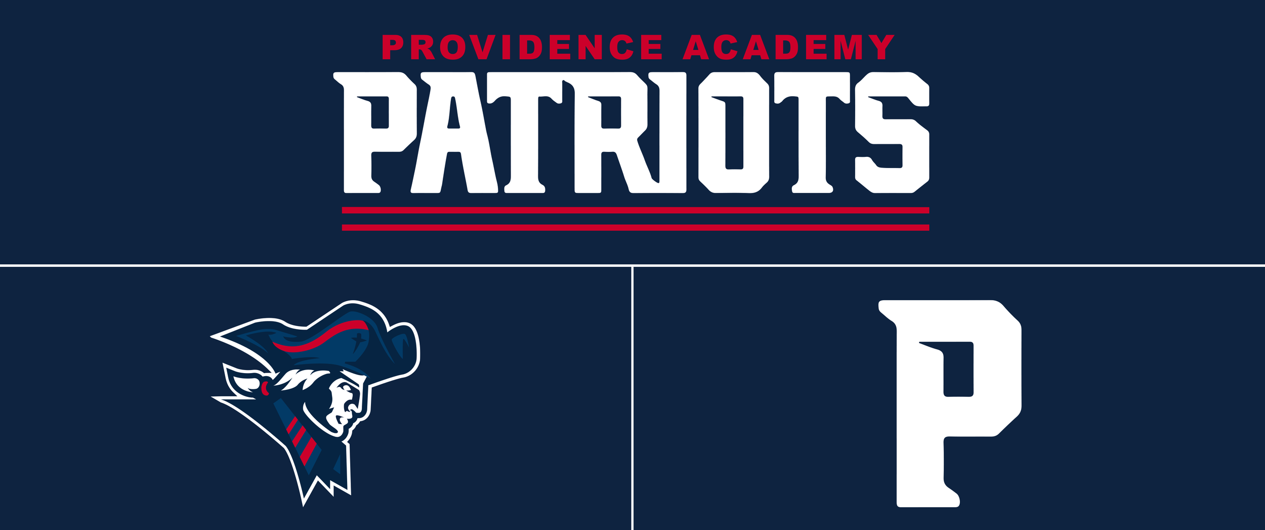
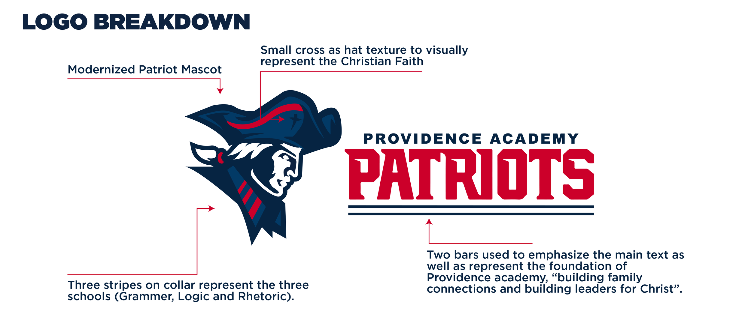
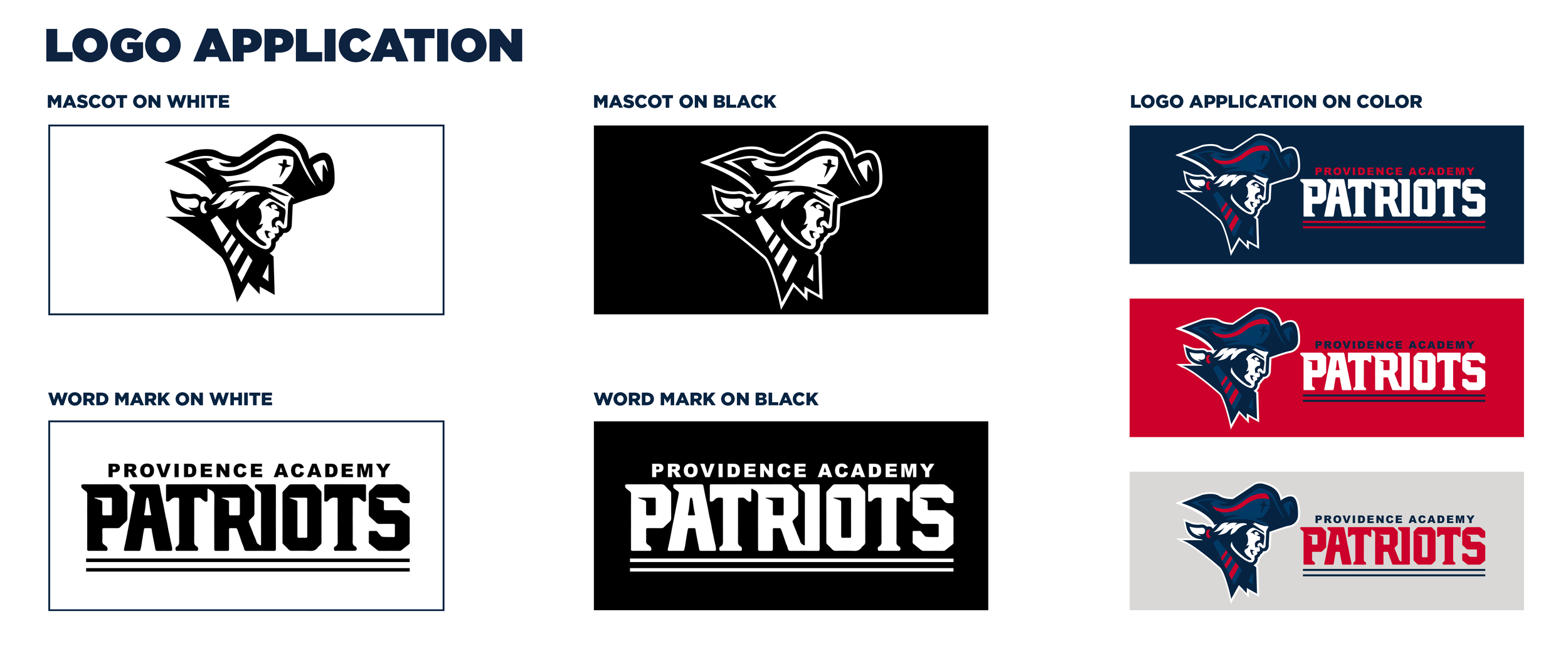
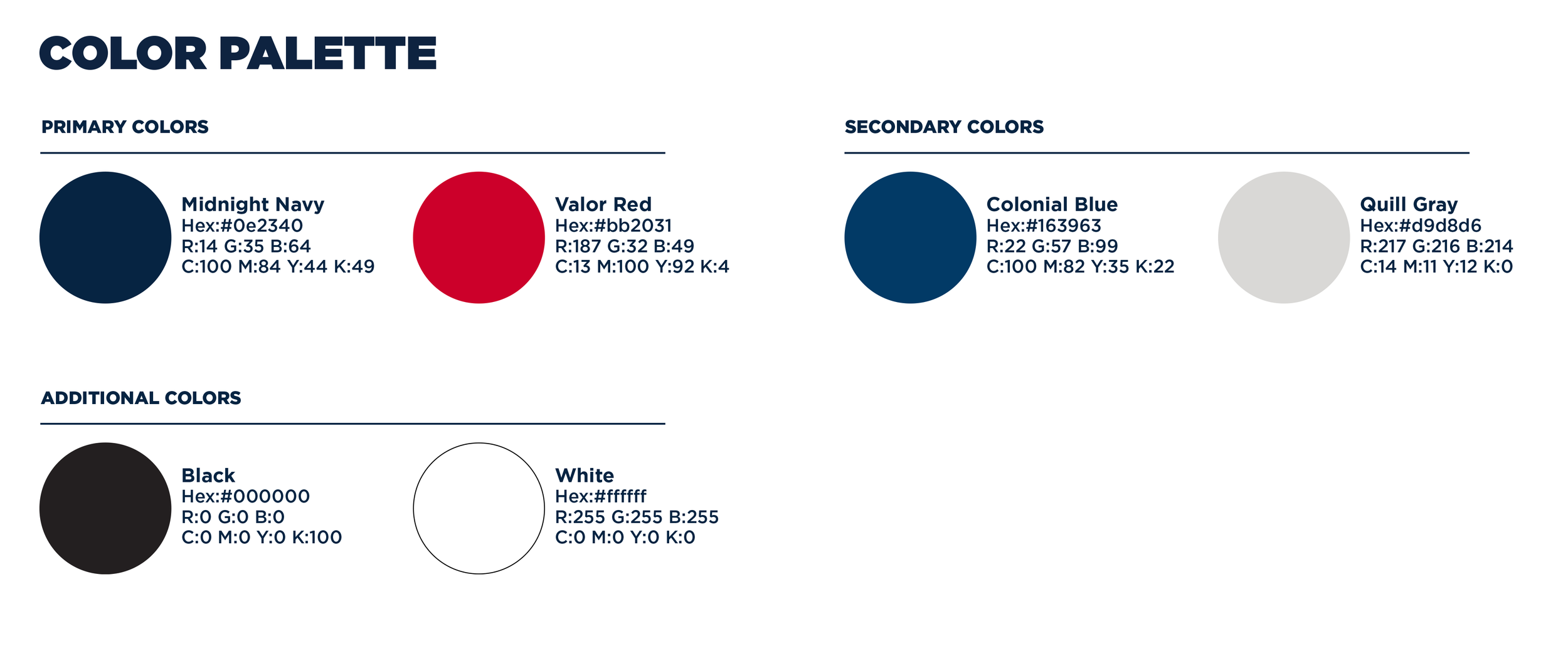
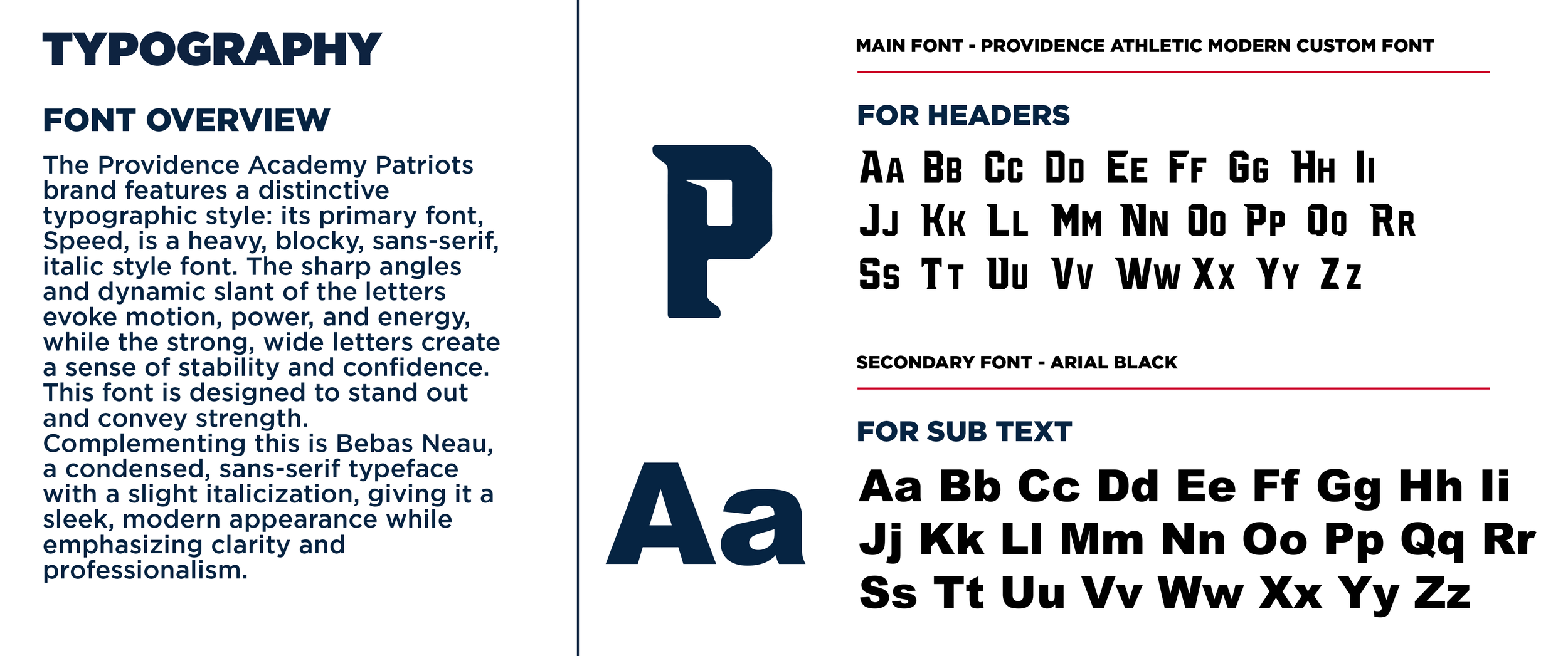
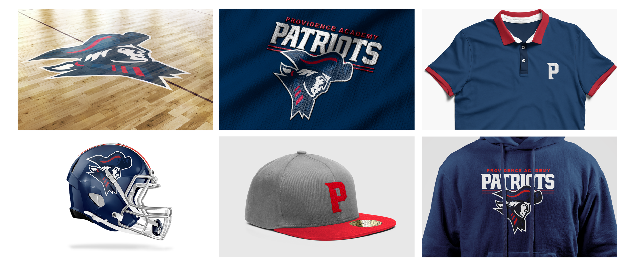
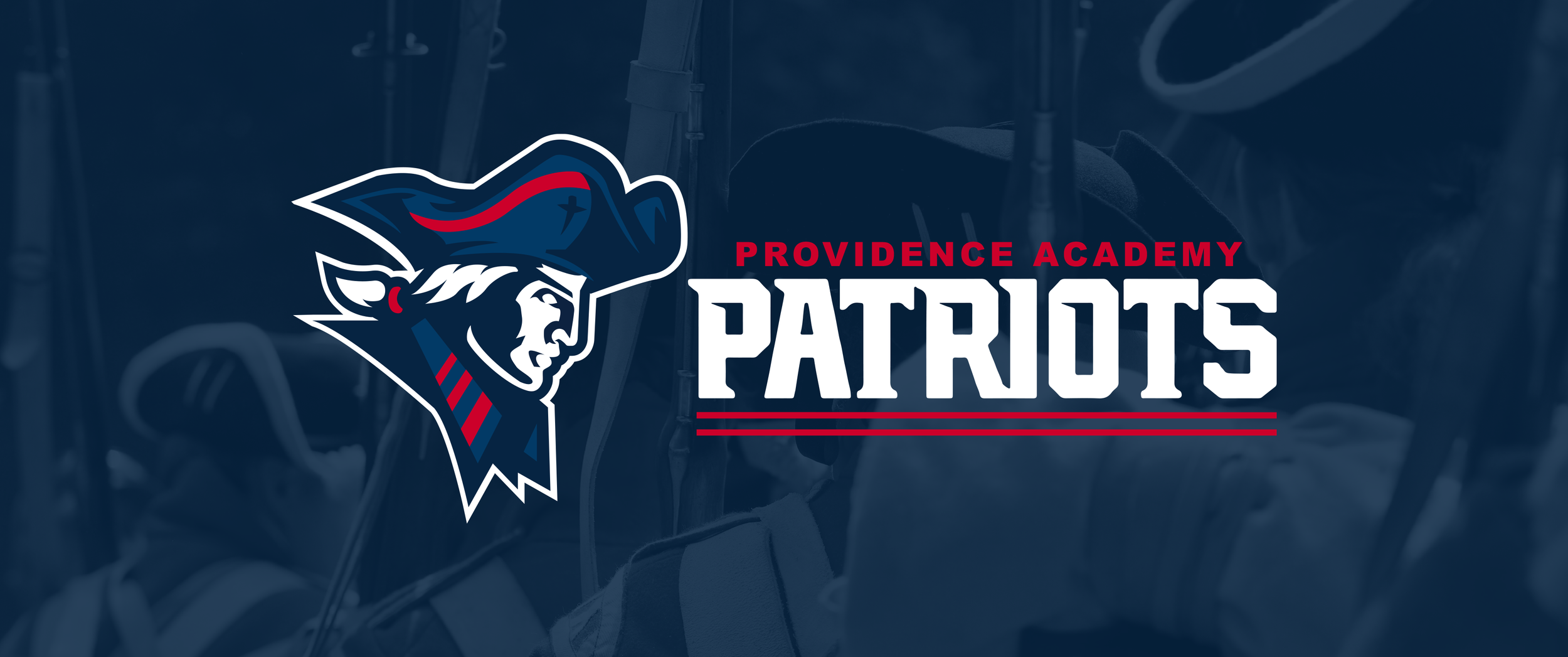
Drawing inspiration from the Patriot mascot, I developed a modernized athletic identity centered around a strong, recognizable Patriot mark. The system pairs the primary mascot with custom typography, an alternate wordmark, and an updated red, white, and blue color palette, creating a flexible visual language that feels at home across uniforms, apparel, merchandise, signage, digital media, and school communications.
More than simply updating a logo, the project was about creating an identity Providence could build around. The final system gives its athletic programs a consistent and recognizable presence while capturing the tradition, school pride, and competitive energy of Providence Academy.
Project Scope
Discovery & Research
Primary Identity Development
Custom Typography
Alternate Wordmark
Updated Brand Color Palette